This is a public peer review of Scott Alexander’s essay on ivermectin. You can find an index containing all the articles in this series here.
While “Worms!” was the sticky, memorable takeaway from Scott Alexander’s ivermectin piece, he doesn’t stop there: he has another ace up his sleeve, which he deploys to discard the viral load results:
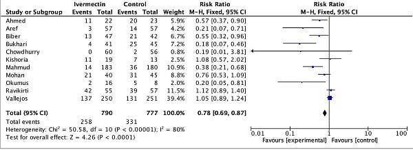
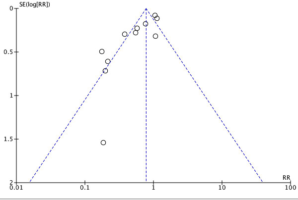
Worms can’t explain the viral positivity outcomes (ie PCR), but Dr. Bitterman suggests that once you remove low quality trials and worm-related results, the rest looks like simple publication bias:
There’s a lot to say here, but let’s start with Scott’s description of the analysis:
“…once you remove low quality trials and worm-related results…”
Has the ad-hoc meta-analysis we’re shown excluded “worm-related results?” Actually, no. It included Mahmud and Ravikirti, which Scott already described as being in high-prevalence areas—and are included as such in Dr. Bitterman’s meta-analysis.
As for low-quality trials, it includes Aref, Biber, and Chowdhurry—which Scott and Gideon Meyerowitz-Katz already discarded for being low quality. Especially Biber was discarded wrongly in my view, but we’re judging the statement from Scott’s frame.
Further, it includes Okumus and Kishoria—which are classed as late treatment trials and therefore were not analyzed in Scott’s article at all. Had he looked at Kishoria specifically, I’m pretty sure he would have thrown it out, what with baseline differences, not reporting on 3/16 control patients, recruiting patients that did not respond to standard treatment….
Long story short, of the 11 studies in this analysis, two are “worm-related results,” three are studies Scott rejected for being low quality, and two had not been examined at at all (and one looks terribly low quality).
In other words, while Scott says this analysis includes no “low quality trials and worm-related results,” it actually includes mostly (6 of 11) “low quality trials and worm-related results.”, according to his own evaluations.
What Are Funnel Plots and Why Do We Care?
Much like the methods of John Carlisle, funnel plots are a statistical screen commonly used to investigate meta-analyses for the presence of bias. In particular, what people are most interested in is publication bias: negative studies that never get published because they look boring. The general idea is that if—when plotting studies alongside two axes, one denoting the positive/negative strength of the result, and one denoting the precision of the study (roughly, a proxy for size)—you should get something that is reasonably symmetric. Since more precise trials are more likely to zero in on the “right” answer, you should expect more variation from the smaller trials. When there is some kind of publication bias, you would expect to see some kind of asymmetry in the funnel plot, often in the “negative results” side, which is where you’d expect to see a file-drawer effect.

This is where the marketing pitch ends, and the problems begin, though. You see, initially, these plots were intended to be inspected visually. Well, it turns out researchers often can’t agree on whether funnel plots are asymmetrical or not upon visual inspection. So we turned to using statistical formulas to evaluate the bias “objectively.” Except, of course, there are many different ones, so people tend to pick-and-choose:
Using 198 published meta-analyses, we demonstrate that the shape of a funnel plot is largely determined by the arbitrary choice of the method to construct the plot. When a different definition of precision and/or effect measure were used, the conclusion about the shape of the plot was altered in 37 (86%) of the 43 meta-analyses with an asymmetrical plot suggesting selection bias. In the absence of a consensus on how the plot should be constructed, asymmetrical funnel plots should be interpreted cautiously.
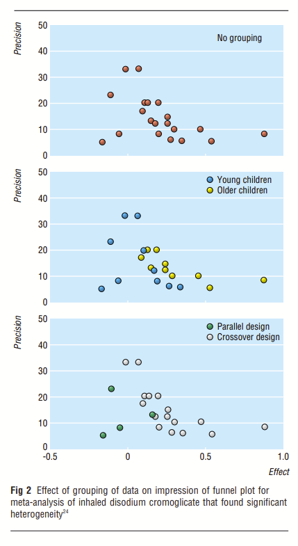
Further, the heterogeneity of the studies being plotted can make the results appear as if a bias exists, when in fact, what is visualized is between-study heterogeneity:
As Choi and Lam explain in “Funnels for publication bias – have we lost the plot?”:
Despite Egger's careful explanation of the possible causes of funnel plot asymmetry, asymmetry is more often than not solely attributed to publication bias. But in addition to publication bias and pure chance, what other factors contribute to funnel plot asymmetry?
True heterogeneity in intervention effects is one such factor. For example, a significant effect may only be seen in high-risk patients, and these patients were more likely to be recruited into the smaller, early trials. Larger, multi-centre interventions involving hundreds of patients may be more difficult to implement when compared with smaller trials, and, in addition, there may be methodological differences between centres. In such a case, the data from the smaller, better-controlled study may be more precise than the larger, and perhaps less vigorously implemented study involving a more heterogeneous group of participants.
The meta-analysis linked to the funnel plot shows a heterogeneity metric I^2 of 80% with p < 0.00001. What does this mean? According to Cochrane, it could be in one of the two following categories:
50% to 90%: may represent substantial heterogeneity
75% to 100%: considerable heterogeneity
Given the low p-value and high I^2 value, we can be pretty sure that the studies qualify as having a high degree of heterogeneity.
John Ioannides and Thomas Trikalinos did a study of meta-analyses to see where the funnel plots were used inappropriately. They set a “not very demanding” threshold of 50% heterogeneity, above which they did not consider the use of the various statistical tests to be meaningful. They also tried an alternative analysis, with “even more lenient” criteria, one of which was heterogeneity no greater than 79%. The funnel plot Scott references does not qualify as “meaningful or appropriate” under either set of criteria. As the authors note:
Some debate about the extent to which criteria need be fulfilled for asymmetry tests to be meaningful or appropriate is unavoidable. The thresholds listed above are not very demanding, based on the properties of the tests.
Besides, 10 studies is usually considered a rule-of-thumb minimum—that not everyone agrees is sufficient—and in this case we’re looking at 11 studies, so we’re skirting on the edges of reading signal into noise anyway.
Demonstrating the Problem
We don’t have to rely on abstract theory or metrics-wrangling to be doubtful of the funnel plot. Before reading up on all this background, I had exactly this same hunch. So I looked into the specifics of the PCR positivity endpoint used. Right before publishing, I also added the recruitment mid-point for each study. Here’s the amended table:

You see, the endpoints on this meta-analysis are measuring the PCR positivity of patients. So what happens if we separate them by when that PCR test was taken?
Strangely enough, the strongest (leftmost) results tend to be those which waited the most days to take the PCR test. So the red dots are 10-14 days after starting treatment, while the most neutral or negative results are those that didn’t give enough time for the treatment to work (blue, three days). Given what we’ve already discussed about PCR tests and dead nucleotides, these are the least surprising results the world has ever seen, and point to very different explanations for the asymmetry observed.
What if we—instead—color the results by the midpoint of the recruitment period, as a way to distinguish earlier from later studies?
It seems the May 2020 studies fall to the left, the July and August 2020 studies cluster towards the middle of the group, and the Fall 2020 studies are to the right. As time passes, we have a move towards the right (smaller effect), except the one study with a midpoint in March 2021 (Aref), seems to be an outlier, falling closer to the May 2020 studies. You heard it here first folks:
FOR IMMEDIATE PRESS RELEASE
NEW JOURNAL OF THE AMERICAN MEDICAL JOURNAL OF MEDICINE (NJAMJM):
IVERMECTIN ONLY WORKS IN THE SPRING AND A LITTLE IN THE SUMMER
Or… with such few data points and so much heterogeneity, you can prove almost anything. You don’t have to believe me that these are the only two classifications I tried, but it’s true.
If “days after treatment initiation” or “recruitment midpoint” was not enough of a confounder, consider dosing, patient severity, variant, time since symptom onset, or PCR cycle thresholds. For instance, Biber and Vallejos used 30 cycles as the threshold for positivity. Ahmed used 40 cycles as the threshold. Many of the others did not document the cycle threshold they used, and have not responded to an email request asking for clarification. Plotting all these studies in one chart and attributing “publication bias” as the sole explanation for the difference would make many of the biostatisticians whose papers I’ve been reading run for the fire escape, screaming incomprehensible things about chi squared. In fact, Matthias Egger, the popularizer of the funnel plot, prefers to talk about funnel plots as a method of identifying “small-study effects,” rather than immediately attribute any asymmetry to publication bias.
What Are We To Make Of All This?
As I’ve progressed through evaluating Scott’s essay, I’ve tried to stay consistent with this one message: statistical screens are useful, but never conclusive beyond reasonable doubt. When one of these tools returns a highly suggestive result, the appropriate response is to investigate further, not declare “publication bias!” and move on. In particular, in this case, we’ve seen a few reasons to be skeptical of the funnel plot: the small number of studies and between-study heterogeneity, visible both using metrics but also empirically, give rise to much uncertainty as to how the plot should be interpreted.
So, is there publication bias in ivermectin viral load results? Well, first of all, we have to highlight that we’re not talking about publication bias at all here, since the studies discussed were taken from ivmmeta—which lists studies still in preprint or that have merely been mentioned in passing in the press. It’s how they try to counteract publication bias, and I think it’s a good approach. So what kind of bias would it be if it really were a bias? Some kind of reporting bias, I suppose, but likely at a much earlier stage of the publication process.
While I’ve heard about studies that were run but did not produce any results (e.g. the single-dose ivermectin arm and the doxazosin arm of the TOGETHER trial) I’m not too sure how to quantify that. The only studies I know of having trouble getting published were positive for ivermectin (Biber et al., Bryant et al.) and of course there’s the blatantly ridiculous retraction from a preprint server for Merino et al. I’m not aware of a case where a negative study had trouble getting published, but of course that might just be me. Pierre Kory has a long list of other high quality studies being summarily rejected from major journals. What stuck out to me was this email from Dr. Eli Schwarz, senior author of the Biber et al. study we’ve covered previously:
Hi Pierre, the sequence of submissions were: NEJM, Lancet- eclinical medicine, and Clinical Infectious Disease. The rejections came within a few hours. At that time I did not submit it to medRvix (pre-print server) to avoid rejection based on "already published information." Now, we submitted it to Clinical Microbiology and Infection and in parallel to medRvix.
I’ve considered updating the funnel plot—as well as comparing the results when dropping non-published studies—to see if there is some directionality. Even so, if the result is favorable towards ivermectin, I can foresee a counter-argument in the form of “the positive studies for ivermectin didn’t get published because they failed peer-review due to their low quality.” And really, it might even have some merit. This is what we’re faced with when tromping in such murky waters. Funnel plots are supposed to give us new insights, but in this particular situation, I come away with anything but.
Here, again, I fault Scott for taking extremely preliminary, non-peer reviewed work— with no pre-published protocol—or literally any protocol that can be evaluated at all—and broadcasting it to the world as something that disqualifies the work of hundreds of scientists who went through all the motions. Consider the reckless disregard required to put up a single Tweet against dozens of published papers and, in violation of every single guideline or best practice around funnel plots, simply declare the cause to be “publication bias,” and this after having spent thousands of words harping on about peer review, respect for established scientific process, quality of journals, pre-registration of protocols, and the like.
I try to keep my tone civil as much as possible, but the mind truly boggles.
This is a public peer review of Scott Alexander’s essay on ivermectin. You can find an index containing all the articles in this series here.


My first thought on hearing about the theory it was just publication bias was that when it came to Covid all rules were off. I mean many would have us ignore the huge spike in VAERS because a vaccine campaign like the Covid one was unprecedented. Likewise, what probably is a nice guide for normal times doesn't necessarily apply in the 'war time' that is the pandemic. I still would give the concern merit over in the early going but over time, once it became clear there was stigma to suggesting miracle cures unless you were Fauci talking about the game changer Remdesivir, that to tout a generic Drug would conflate you with Trump, all assumptions about publication bias should probably be tabled.
Great work. You should also be looking at dosis. My recollection is that Vallejos (which has the highest weight in the meta analysis) is badly underdosed. This is exactly the kind of thing that would create funnel plot assymetry: one underdosed large study pulling the central axis of the funnel to the right and lots of smaller correctly dosed studies whose estimated effect sizes float around the true effect size of the correct dose, which is to the left of the central axis.